
Visual identity design
Assets, production and delivery
Brand guidelines
Named by Christian Turner at Letterhead, Wonderfield is the new name for one of the world’s leading food and restaurant businesses, the owner and operator of brands such as Panko and Yo! Sushi.
The Wonderfield symbol is a field of emanating dots, aiming to suggest a sense of scale, wonder and at the same time organised precision.
The symbol also reflects the key idea of ‘many’, with each dot symbolising one of the many brands, sub brands, product brands, restaurants, individual products, and people.
Wonderfield is not one thing, but the sum of its many parts.
The four-colour gradient references a field of possibilities and flavours, further addressing the idea of ‘many’. The colour palette of coral-red and light pink offer warmth and a subtle allusion to the Japanese heritage of the company.
Lettering is composed, adapted and spaced by hand in a set of logo compositions that suit different touchpoints.

Wonderfield symbol
Primary logo
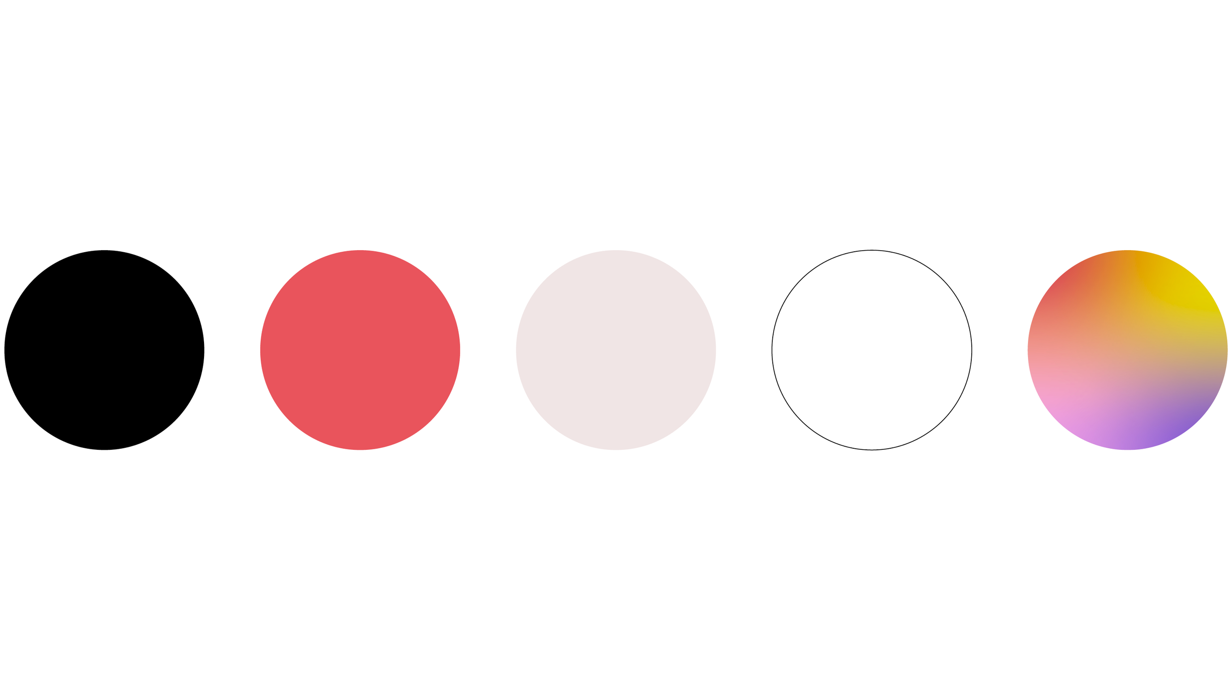
Colour palette

Look & feel
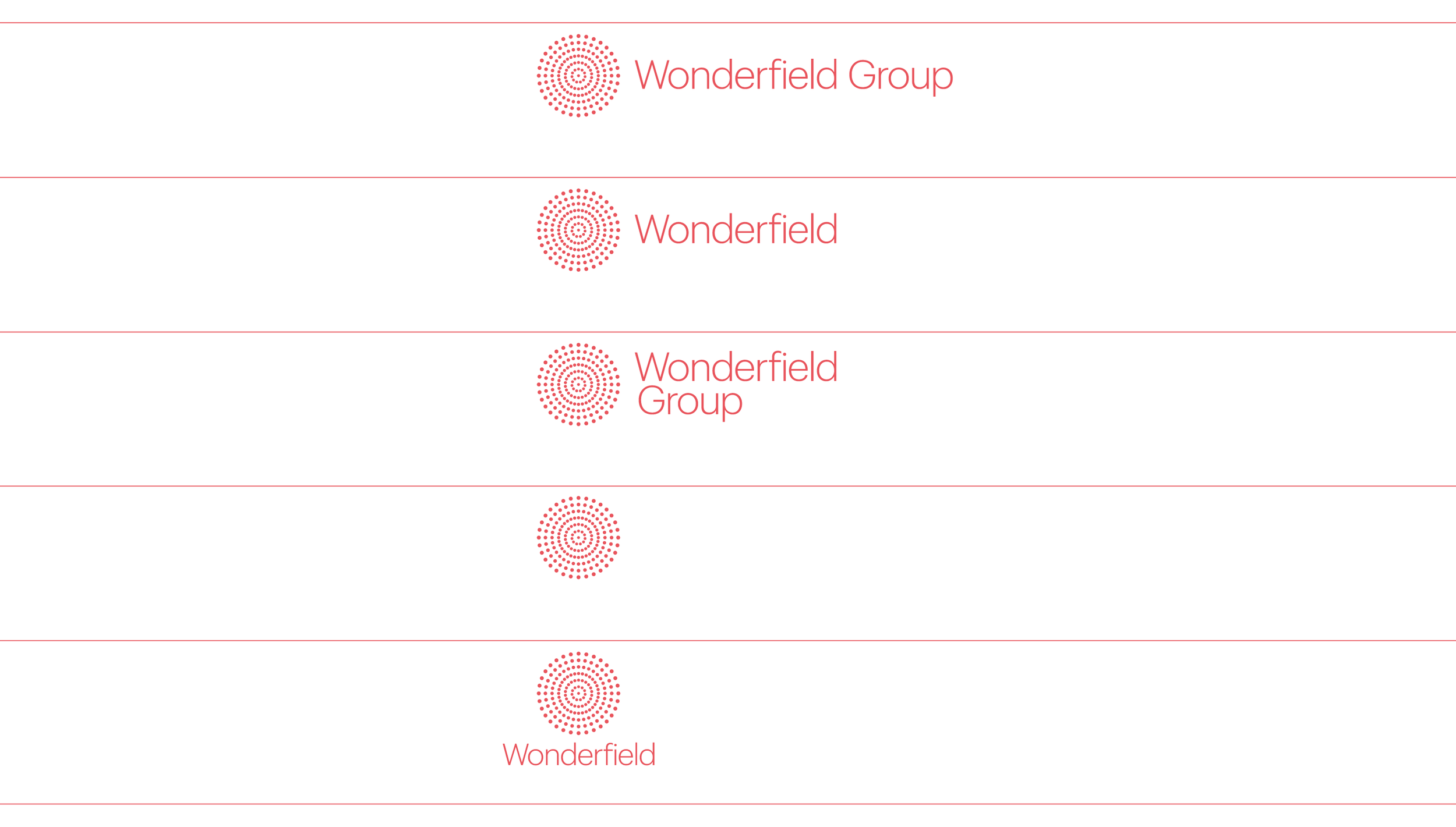
Logo suite
Wonderfield app icon
Typography close up
