Logo design
Asset delivery
Label and other packaging advice
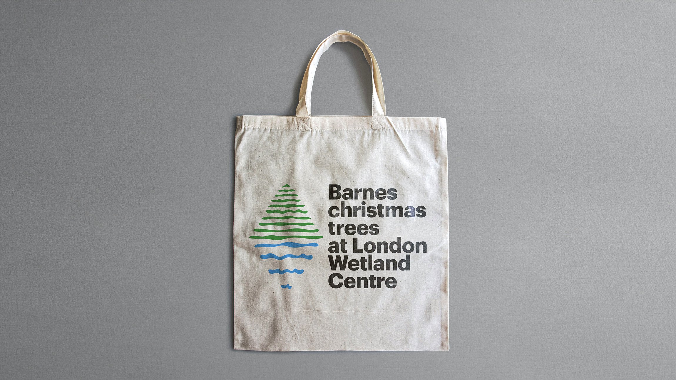
Logo design for Barnes christmas trees at London Wetland Centre. The aim is simple, to draw a connection between what they offer and where they are.
The solution was to find a visual way to encapsulate and combine those two things in a symbol that can become recognisable over time beyond it’s straightforward immediacy to anyone seeing a sign or poster for the first time.
The symbol is a snow-topped fir tree whose reflection in blue gives away the location. The two halves of the symbol line up with the relevant words in the stacked typography, to further affirm the literal nature of the design.
2021

