Visual identity design
Assets, production and delivery
Brand guidelines
Presentation templates
Untypical is a new approach to housebuilding with big plans for the coming years. The name, by Christian Turner at Letterhead, establishes and reflects a blatantly clear position: difference.
The visual identity had to embrace that idea fully, while also grounding the brand in housebuilding and construction. High-vis colour is part of the construction world, and picking a vivid purple gives immediate difference, stand-out and the basis for distinction and familiarity in the market. Pale green and black are used with the vivid pink.
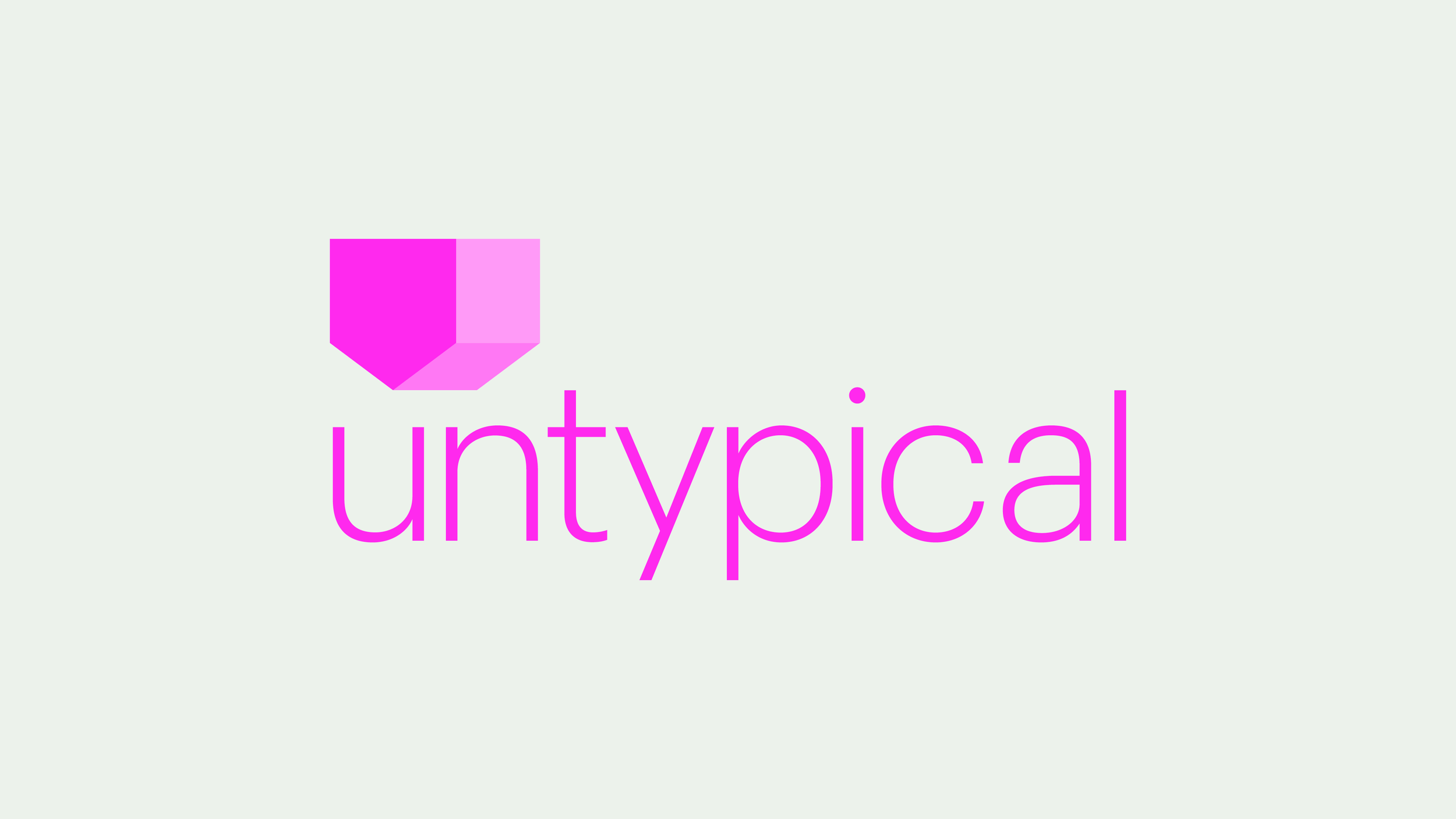
The symbol is an extension of the strategy and name. We’re familiar with houses and have been from age 1. Flipping this well-known symbol presents an obvious story: this is housing, but it’s different to normal.
Bespoke lettering is light and carries an understated confidence, allowing the symbol presence, while the rest of the brand’s typography is simple and bold, hoping to feel classic and timeless in its less is more approach.
As a repeat pattern, the symbol refers optimistically to rows of houses in a connected community, and allows a practical and useful design asset for the brand to use that reduces the need for photography imagery.
Year: 2024
Design: Mike Scott
Naming: Letterhead

Early idea generation and design exploration

Suite of logo compositions

Website design


Guidelines document
