
After naming Superscript, the next task was to develop a contemporary, distinctive and flexible visual identity.
The logo, whose overall footprint is drawn to an exact 7:2 ratio, presents the idea of raising up, raising above the line, and raising standards.
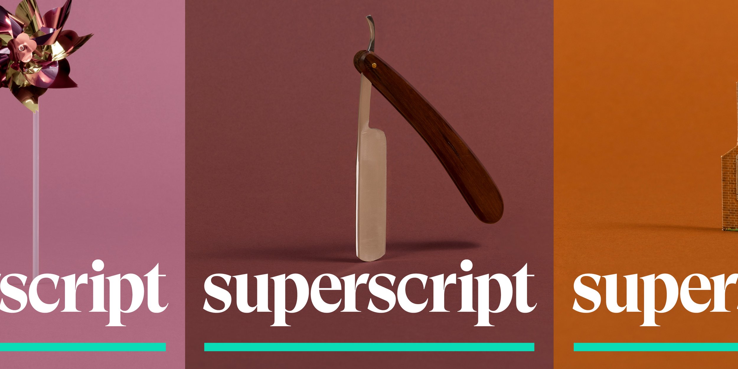
The typography is a bespoke cut of Wallop, made by Displaay Type foundry, with a little weight added and a handful of switched glyphs. Wallop22, as it was named, gives the brand a particularly characterful feeling, but not an unserious one.
A library of 160+ bespoke images was devised and produced, through an efficient photoshoot set up that yielded a cost-per-image that was roughly 40% less than the cost for the equivalent set using stock imagery.
The library consists of objects in a tone-on-tone style, with backgrounds harmoniously matching with the main colour of the object. These images are used to relate to themes literally or laterally, and are used across brand and advertising touchpoints, creating familiarity across media.
Simple graphic compositions inspired by data visualisation, using a two-tone style reminiscent of the images, were also created, allowing specific products to link back to the masterbrand look & feel while having their own assets that give them options in their own markets.
For the broker side of the company, these are flat, data-like illustrations that show a unique look in the world of brokers. For web3, they are translated to textured 3D animations that are more freeform and transient.
Concept, design & art direction: Mike Scott
Design support: James Snook, Matt Reid, Marie McDermott
Photography: Michele Panzeri
Videography: Reuben+Jamie
Motion & animation: Reuben+Jamie
Make-up: Konnie Daniel, Anna Gibson
CMO: Mai Fenton
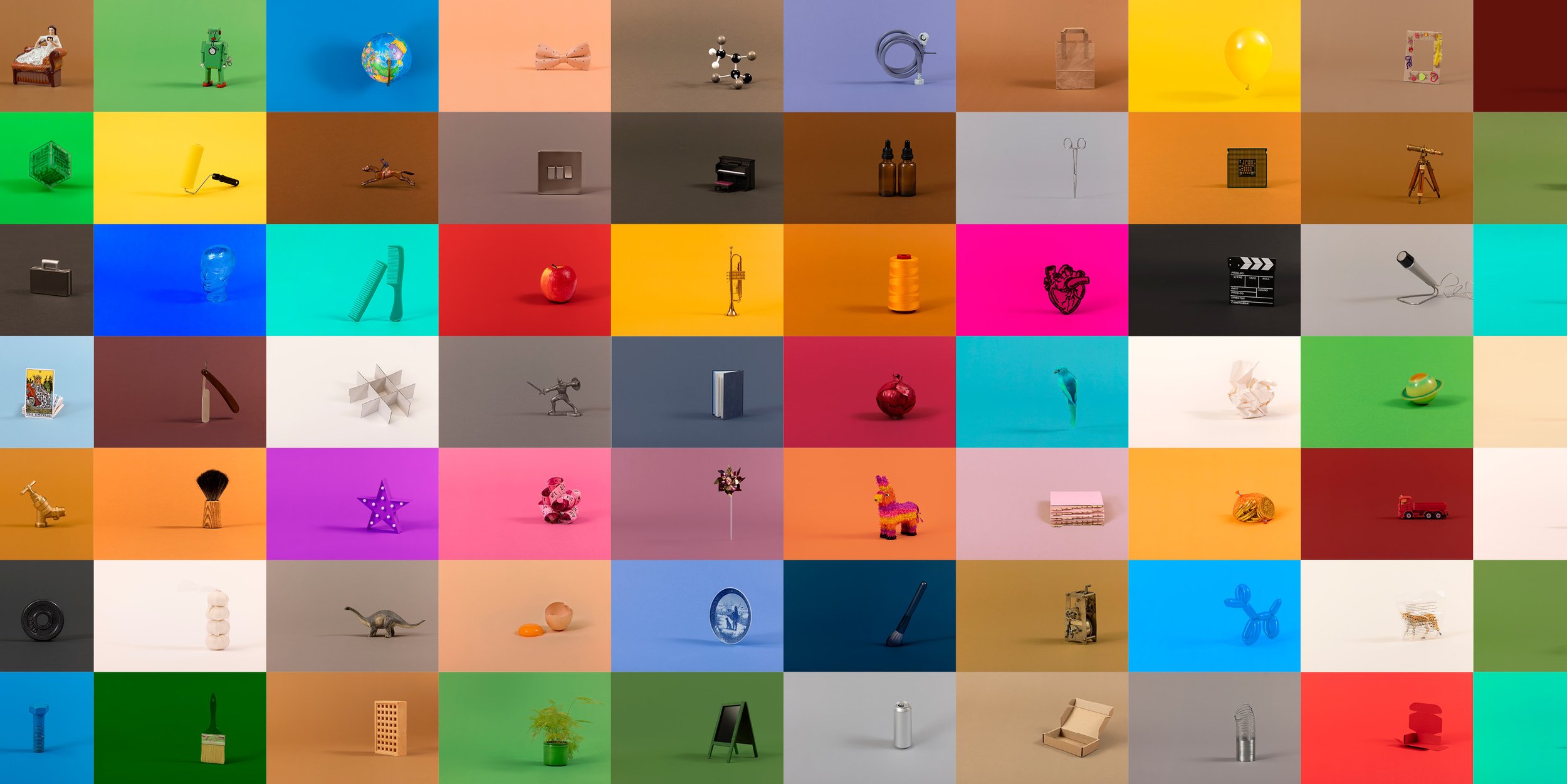
Bespoke image library of over 200 images

Look & feel adapted to different parts of the business

Masterbrand colour palette
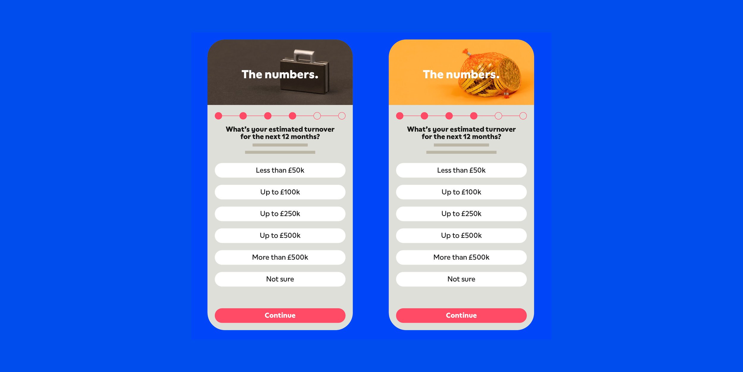
UX and UI
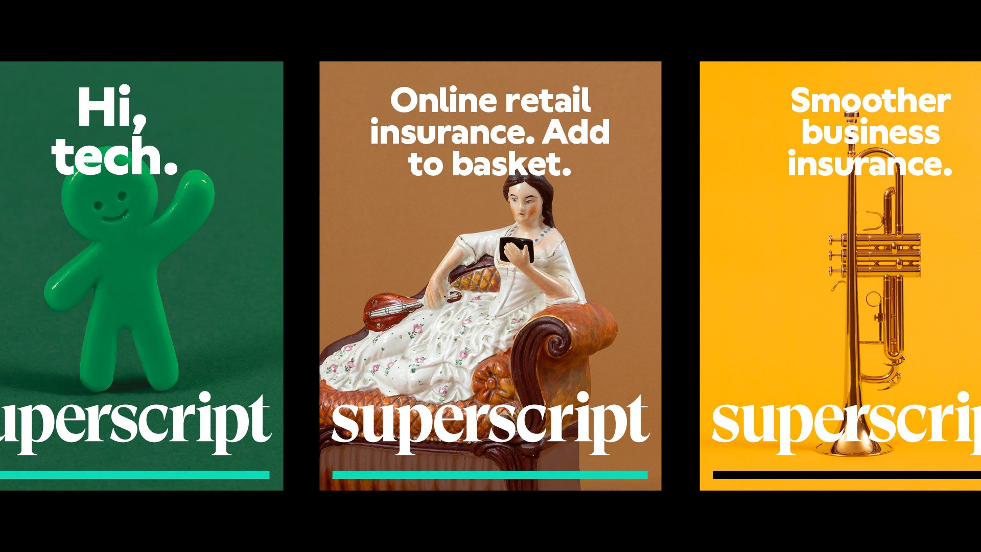
Visual identity in action