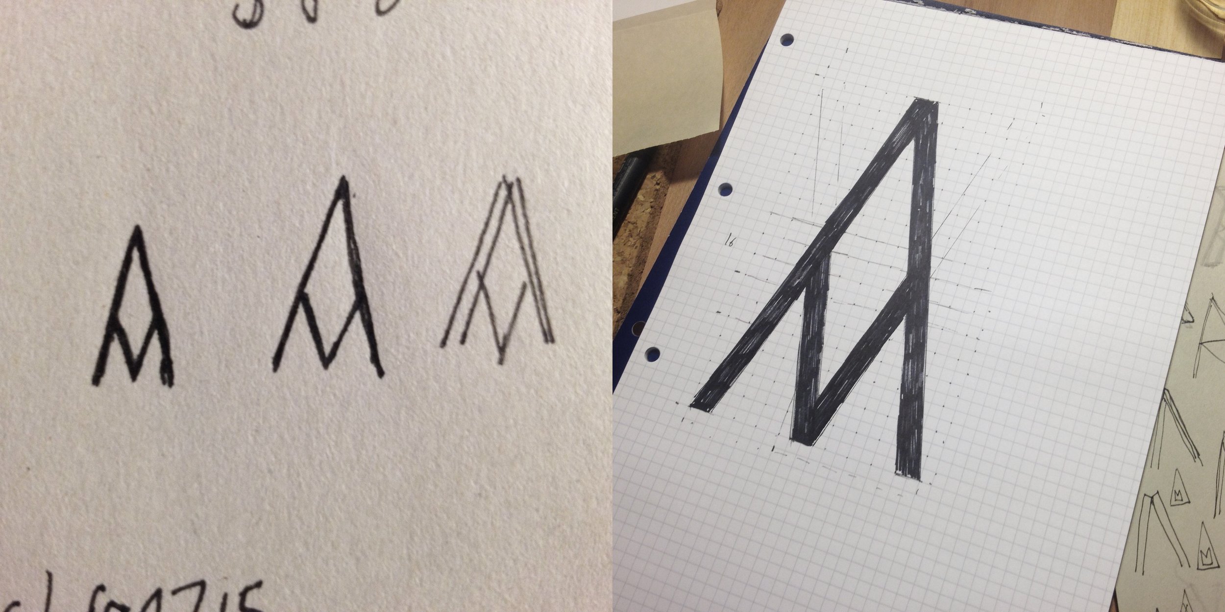
A then-upcoming, now 10-strong, architect practice wanted to buck some trends. Studio Ageli needed an identity that reflected their approach and unique character.
Like the work the practice does, eclecticism, creativity and sensitivity to forms go before the superficial or trends. An unexpected colour palette of dusty pink, pastel green and deep yellow sets Studio Ageli apart from other architects.
The A symbol is a distinctive lettermark that implies structure — 3 stacked As — and alludes to a different way of seeing. The brand helped to quickly establish the studio on the London architectural scene, and the website is an ever-growing library of projects that are presented consistently and updated easily.


