Onggi, named by Christian Turner at Letterhead, is a food brand making authentic small to medium batch kimchi in East London.
They are now stocked in more than 40 shops and always sell out their stalls and orders. I created the visual identity and worked with the owners – Miji and Alex – on the packaging and other visual assets.
The playful branding makes sure their kimchi stands out on the shelves, being totally unique and aiming to be as immediate as possible.
Fans of the product have responded with enthusiasm to well to the branding, seeing it as a fitting design for the flavours and the people at the heart of it.
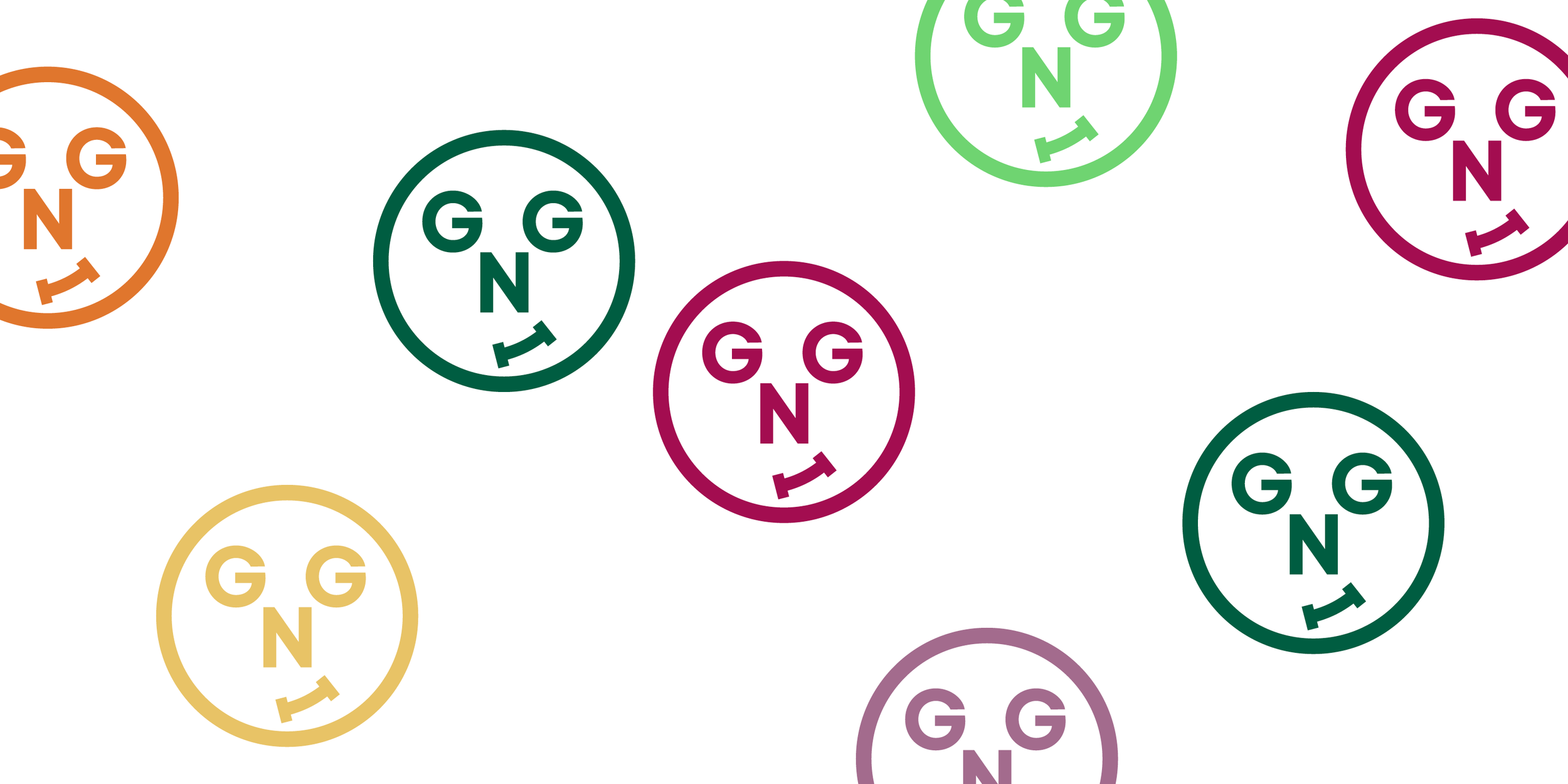
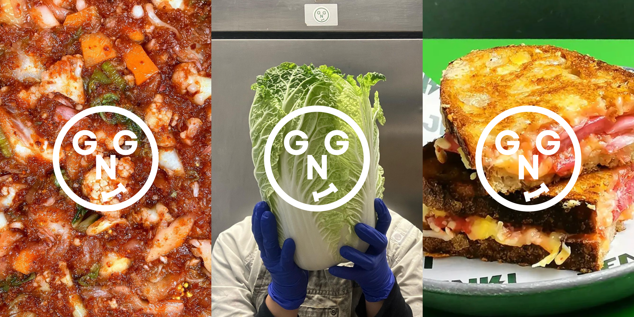
The symbol, in a slightly childlike naive style, presents a face in the process of eating, using only the letters of the name and wordmark, including a distinctive curved letter “I” to make this work.
Colours are inspired very directly by the ingredients and product varieties, allowing a sense of the product and its flavours to always be present, as well as for different jars to be distinguishable between each other.


