Letterhead is a young writing agency started by old heads Christian Turner and Vicki Howard. Two revered writers in London, with extensive credentials over a 25 year career working on global naming and writing projects for brands small and big, very often very big.
They had clients, and they were already too busy, but they needed an identity to establish themselves in the industry as a company, as they were both known individually.
As seasoned brand people, they knew they needed a proper design system and bespoke website. As well as being things they didn’t have, these were also things that
many (not all) of their competition didn’t have: writing agencies have tended towards the twee and delicate, content with the idea that there exists a template for a ‘writerly’ aesthetic.
Christian and Vicki instead recognised the brand creation as an opportunity. To consolidate work and services under Letterhead, to present a feeling, to stand out. And help keep the phone ringing.
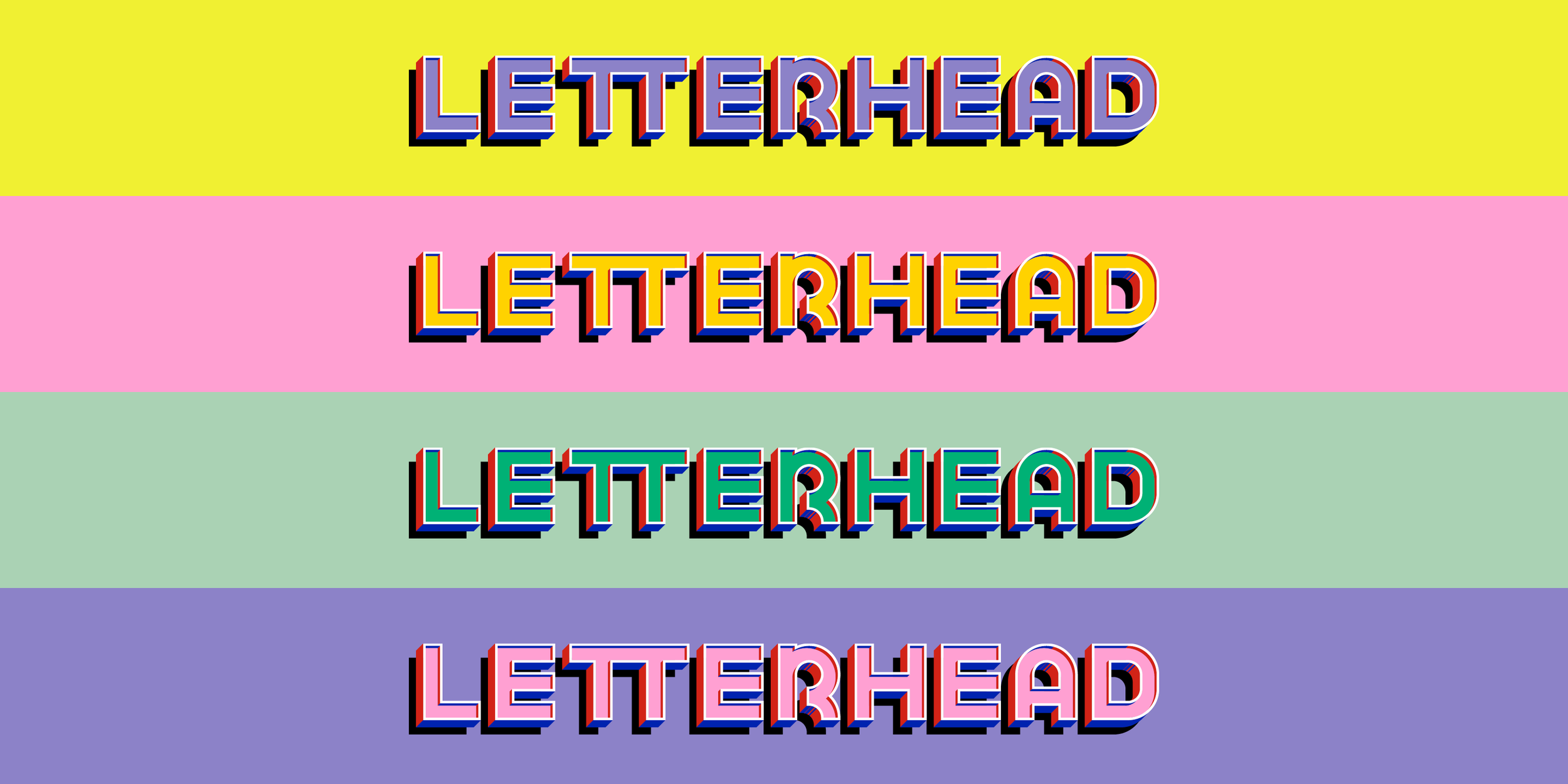
They wanted Letterhead to be optimistic, nostalgic, joyous. Something of a different time, almost passé, yet totally original in its execution and hand made in a modern way.
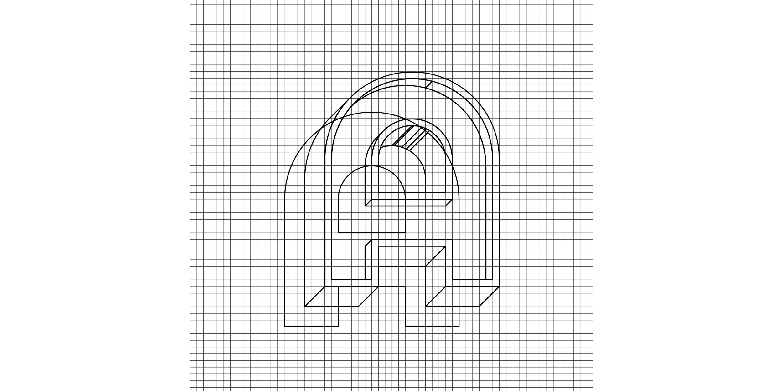
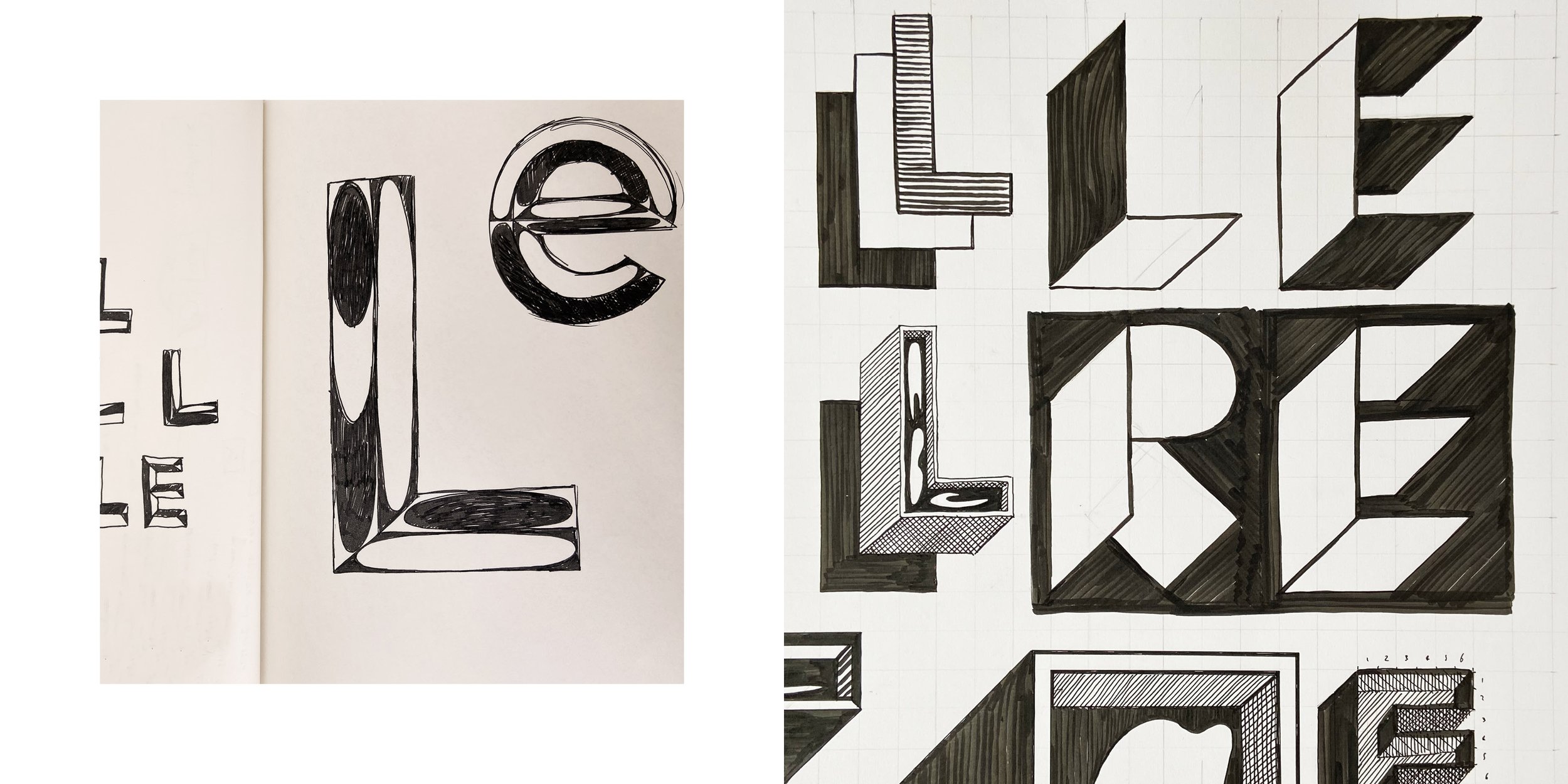
The identity is centred around an unusually large colour palette and a wordmark built from obsessive gridline geometry.
With a 1980s over-appreciation for indulgent bevels and dimensionality, this is a gregarious, over-crafted form.
Even the two Ts ligature. It’s not needed, except that it’s just the kind of type trick old cop show titles used to pull. Images were specified in two types 1) abstract, colourful and grainy, and 2) metaphorical and surreal. These add to the filmic, over-done sense of stories and drama, and the mishmash of styles.