Verbal expression
Visual identity design
Assets, production and delivery
Brand guidelines
Presentation templates
Website design
Digital advertising templates
Big in Denmark, Embla is now launching in the UK with a new brand. Embla creates detailed hyper-specific plans to suit a client’s life, genetics, career, relationships, schedule and medical history. No outdated ideas, no oversimplifying, no calorie counting. Clients get access to the Embla app, 1:1 coaching and carefully prescribed assistive medication.
Because people are naturally complicated, the new strategic vision for Embla embraces the idea of complicatedness in its positioning, inspiring the verbal expression in an extensive phase defining traits for style, voice, terminology and creative copy. Everything verbal was brought together into a 60-slide working document for the internal team to use.
The visual identity had to be different to the rest of the market in just the right way, just like Embla. A comprehensive visual audit of 16 competitors in the UK and Denmark demonstrated the common non-distinctive characteristics for us to avoid.
A very specific yellow allows Embla to be distinctive and fresh in an instant, as well as bold and high-contrast (rare in the market) when combined with black.
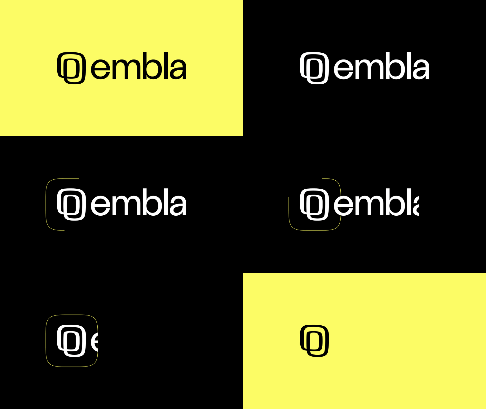
The hand-drawn symbol presents an overlap, a complication. Not just a simple line or direct path. That’s the work, the challenge, the lack of shortcuts. The symbol’s doodle-like quality continues in a set of nine graphical illustrations that allude to themes in a lateral way.
Handcrafted typography and bespoke icons are also part of the redesign, as well as art direction recommendations to create distinctive, non-generic imagery in categories ranging from ingredients (getting closer to food), people in authentic settings, and aspirational meals.
Copy, creative direction, design: Mike Scott
Brand strategy: Andy Whitlock/Human Half
CMO: Sam Gregory (internal)
Brand manager: Cathrine Moesgaard (internal)

Verbal identity — selected messages

Verbal identity — snapshot of final guide (obscured)

Creative direction

Hand drawn illustrations

Guidelines

Bespoke icons, part of a set of 120 delivered

Selected UI technical guidance for the Embla website and app

Embla app icon in situ

Selected sketches from the exploration stage

Symbol development from the detail design stage

Bespoke typography for the logo

Typography, hand-kerned lettering, composition
